
 Mystery Ltd.’s latest and most unusual food and beverage design project has involved overcoming any phobias about grubs and embracing the idea of insects as a valuable food source. Along with new clients, Shami Radia and Neil Whippey, the design agency has joined the quest to persuade the UK to Eat Grub!
Friends Shami and Neil are the genius founders behind the Eat Grub brand, which was originally founded in 2013 and has been steadily growing its innovative product range and customer base ever since.
 While eating protein-rich insects in other countries around the world is commonplace, the western world has yet to really catch on to this sustainable, eco-friendly and nutritious omega-rich food source.
Neil and Shami have embraced insects as food and are determined to encourage the UK and Europe to do the same. The energetic duo engaged Mystery to help evolve their existing brand identity and take their pioneering brand to the next level.
Brand Positioning and DNA
 “Undertaking our own brand review and positioning workshop, we established the brand’s archetype as The Explorer, with perhaps a little bit of The Rebel thrown in. Explorer brands often represent journeys of discovery and freedom. They exemplify the exotic or a pioneering, boundary-pushing spirit, and with Eat Grub’s mission to bring insect products into the mainstream, the brand definitely resonates with the free-spirited nature of an explorer archetype,” said Mystery in their release.
 Bold and adventurous, Eat Grub’s DNA is all about breaking boundaries, experiencing new and different ways to create a sustainable, innovative, healthy food source. With a conscious belief that insects are the original superfood; a healthy, sustainable and above all tasty source of protein that has been overlooked or forgotten in the West, Eat Grub’s mission to break down the stigma attached to insects and put them back on people’s plates.
 This brand DNA flows throughout the brand’s messaging, packaging and identity.
Brand Identity and Packaging Design
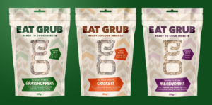
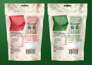
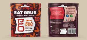
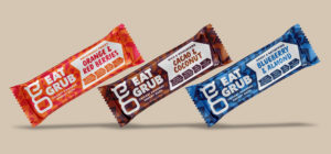
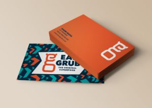
The new Eat Grub logo is designed to convey the energy, creativity, forward-thinking and proactivity of the brand. Modern and engaging, the identity design is a nod to the shells and antennae of the clever crickets that provide the main source of Eat Grub’s insect protein.
 With contemporary and youthful design, the new packaging features clean lines, bold colours and geometric shapes that reflect the intricate patterns, markings and structure of cricket shells. The packs stand out on shelf amongst other energy and protein snack bars, and will appeal to a younger, more adventurous and conscious audience.
 “It was fantastic working with Mystery and we are delighted with our brand new look! Our brief and what we do is particularly challenging (normalising the eating of insects!) but they understood what we needed to achieve from our brand refresh, and were passionate and enthusiastic in their approach. The team and, more importantly, our customers and retailers love the results,” said Shami Radia, Co-Founder of Eat Grub.
The brand recently launched their new identity and products at Food Matters Live to great interest and are very excited about what’s in store Eat Grub in 2018.
Source: Mystery Ltd.
You must be logged in to post a comment Login