
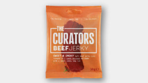
 Startup meat snacks brand THE CURATORS has launched in the UK, with a new brand identity designed by B&B Studio. Challenging established players in the high-protein category, THE CURATORS jerky delivers bold flavour profiles inspired by chefs and world food trends.
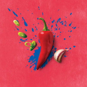
Founders of THE CURATORS, Max Rees and Ed Hauck, are passionate foodies at heart and sought to collect flavour inspiration from around the world. B&B studio introduced a vibrant brand identity which brings together the concept of curating flavours, as you would art, with the process of curing meat.
The Fine Art of Flavour
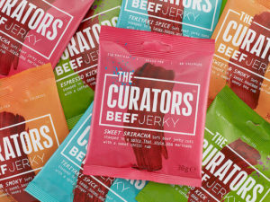
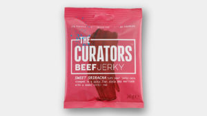
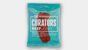
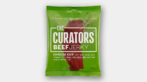 Under the name THE CURATORS, the brand speaks to the artistry of the meat curation and flavouring process, celebrating the beauty of meat and the art of flavour. A single brushstroke of paint that resembles the jerky is featured on each pack, representing the creativity at the heart of the brand.
B&B studio has incorporated bold colours that reflect the passion and enthusiasm of the founders, crafting a dynamic identity that stands apart from competing products in the sector, and speaks to foodies seeking complex flavour profiles such as Espresso Kick and Teriyaki Spice.
Gender-Neutral Jerky
 To date, mass produced jerky brands referencing strong American traditions of cowboys and cattle have dominated the category and even new challenger entrants have aligned with cliched codes of masculinity. B&B studio’s concept for THE CURATORS focuses instead on inspired flavour combinations and the artistry of the product, with a design that feels more modern, tastier, healthier and gender-neutral.
Stepping away from the tough, chewy products that are synonymous with the category, THE CURATORS have devised an innovative method that retains a more tender meat texture and adds depth of flavour, delivering a new dimension to the jerky sector. This is reflected in the brand language, with a challenging colour palette and playful slogans.
A Matter of Taste
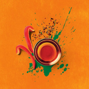
 A simple graphic border around the brand name adds weight to the on-shelf packaging, and provides flexibility for off-pack branding with punchy straplines and imagery of the high-quality ingredients.
Shaun Bowen, Creative Partner at B&B studio, says: “Jerky has been rising in popularity in line with trends for higher protein diets however both established and challenger brands have stuck to relatively narrow type codes, creating an opportunity for a healthy, flavour-rich product like THE CURATORS to disrupt the sector. THE CURATORS’ founders are both passionate foodies fanatical about gathering strong flavours from their travels around the world. Their artistry with flavour profiles inspired our brand concept as the artists of the meat jerky category, reflected in the brushstrokes and flecks of paint across the packaging, playful straplines and vibrant images of the ingredients used.”
 Ed Hauck, Co-Founder, THE CURATORS, says: “Through innovations in how our jerky is produced and flavoured, and the introduction of daring taste combinations, THE CURATORS jerky is unmatched anywhere else in the sector. In such a high-profile market it was crucial for us to communicate these points of difference to our consumers, and B&B studio’s identity perfectly captures our dedication to high quality ingredients and the artistry of flavour curation.”
B&B studio created the brand positioning, creative strategy, name, brand identity and packaging design for THE CURATORS.

Source: B&B Studio
You must be logged in to post a comment Login